
Colourful Draft Excluders
- Cat's Punky Stuff
- Sep 15, 2022
- 4 min read

Updated: Sep 16, 2022
Having studied my garden all year it is now time to create colour boards for this winter's draft excluders.
I think part of the success of the Drafties is that each is made up of many colours so there is always one to match virtually every colour scheme. Certain colour schemes are more popular, with the honey, sunflower, mustards and browns being really popular and the pinks are not so.


I created the colour wheel sheet below to include in my colouring posters, to better understand which colours do and don't go together. The colour wheel can help to develop the start of a new colour palette.

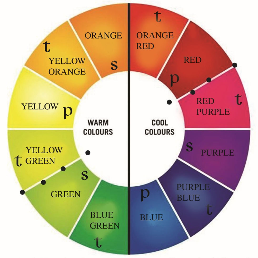
This colour wheel shows clear and accurate changes from one shade to the next. The distance between each primary colour is equal and both can be a fault with many colour wheels. If your wheel is wrong from the start, then your colour studies will be inaccurate.
Having studied colour all my life, from visits to Vence for my master's degree and currently in my garden, colour is something that can go very wrong if not carefully considered.
Below are things I have made with photographs showing where the colour scheme developed from. I'll discuss how to blend awkward colours, what goes well together and what doesn't. Some colours change a lot depending on their surrounding colours!
Blue


'Snowstorm' - Heavy clouds laden with snow flurry down to rest on the ground, eerily quiet and softly forming an icy, sculpted shroud!
Blue is one of the most popular colours, along with browns and greys. This Drafty is a true blue as there isn't a leaning towards green or purple and it fades through to the lightest blue before greys were subtly introduced.
This colour scheme was very simple as I had used a neutral colour to blend the blues into grey
Purple


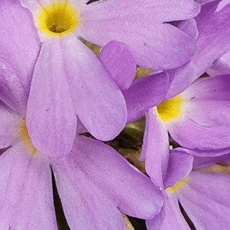

'Lavender Farm'- From a silvery crown rises slender stems, a top dipped in flowers so many, little bees about their day, collecting pollen in a hurry.
This Drafty shows deep bluey purples blending perfectly into olive greens. One option would be to go straight from blue to green around the colour wheel, but I chose to fade each colour and have a neutral, cream in this case, to join the two. I could have used a pale grey on the blue side and light beige on the green side. To help deepen the purple and strengthen the contrasts of the two ends. I added rich French blue
Mauve


'Vibrant Tulip' - Ladies of Spring dressed in silk gowns, the brightest shades against seasonal greys, how your vibrance brightens the dullest days, your colours bold around garden pathways!
This Drafty has to be one of the brightest items I have ever made. From purple through mauve all the way around the wheel to orange. I didn't use red, but instead blended a shocking pink with the same hue orange. From mauve I could have gone red then orange, but that was too simple and so instead I opted for very hot pinks!
Red


'Victorian Plum'- Dusty plums in a bowl on lace, soon to be a pudding ablaze on a plate, drizzled in cream seeping into deep cracks, hot plum pudding and a merry festive hat!
As a rule I very rarely use red, unless it's in chestnut and rust palettes. My preferred portion of the colour wheel is orange through to purple minus the reds, but this Drafty has a very unique colour which I used to blend the burgundy to beige, without using the obvious pinks. I found a colour that was neither purple, brown nor grey and so I could easily blend dark red to fudge brown with this magically colour that has left me without words....what colour is it?
Pink/apricot


'The Cottage Garden'- With the grace of rose and swaying cornflower, statuesque foxies and happy snappy dragons, every colour does a cottage garden grow, intertwined together in a paintbox of showy show!
I love apricot shades as they are so warm and can be blended into browns, yellows or pinks. Mixed with warm browns like fudge and gingerbread, apricot adds a little extra something. Beware though as in a rust/chestnut colour scheme some apricots can turn pink!
Orange


'Sunset On The Fens'- Big open skies on the flattest of Fens, sown of wheat kissed golden by the bye bye sun, a perfect sunset goes orange through to blue, sit and watch is what I do!
I love orange but do not like red and so unless the colour palette is rusty browns or vibrant pinks I struggle to use orange. To blend orange to yellow I always use apricot as orange straight to yellow is always too big a jump.
Yellow


'Middle Of A Daisy'- Daisy in the grass moved by the wind, blessed by a visit from a bee, rewards are a plenty though you be small, spread as you will, across the unkept lawn!
This Drafty features mustard yellows as I'm not a fan of bright yellow. It was an easy blend through buttermilk to beige to lemon then lime. Without the lemon the jump from beige to green would have been too noticeable. I find yellow very difficult to get right and it rarely works to go from yellow to orange without apricot and I always use lemon and lime to blend yellow to green
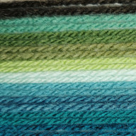
Green


'Shadows In The Wood'- Shhh says the wind as it sings through the wood, keeping safe secrets from an age of wise, deep in the shadows well known to the birds, fairies dance and live their lives
Green is fabulous as can be seen in this Drafty. The many shades of green can be used in any colour palette, lime green is fitting in a citrus scheme, sage greens with
smoky blues and olive greens with greys. I love green as it is so versatile and will enrich any colour palette.


Comentarios